Geek hosting
A comprehensive and consistent suite of materials for a leading webhost.
Web host corporate identity
Bytemark are an award-winning and ethical webhost based in York.
Having worked on their previous branding, I was tasked with updating their materials to strengthen their presence and standing by introducing a more consistent style across a variety of media.
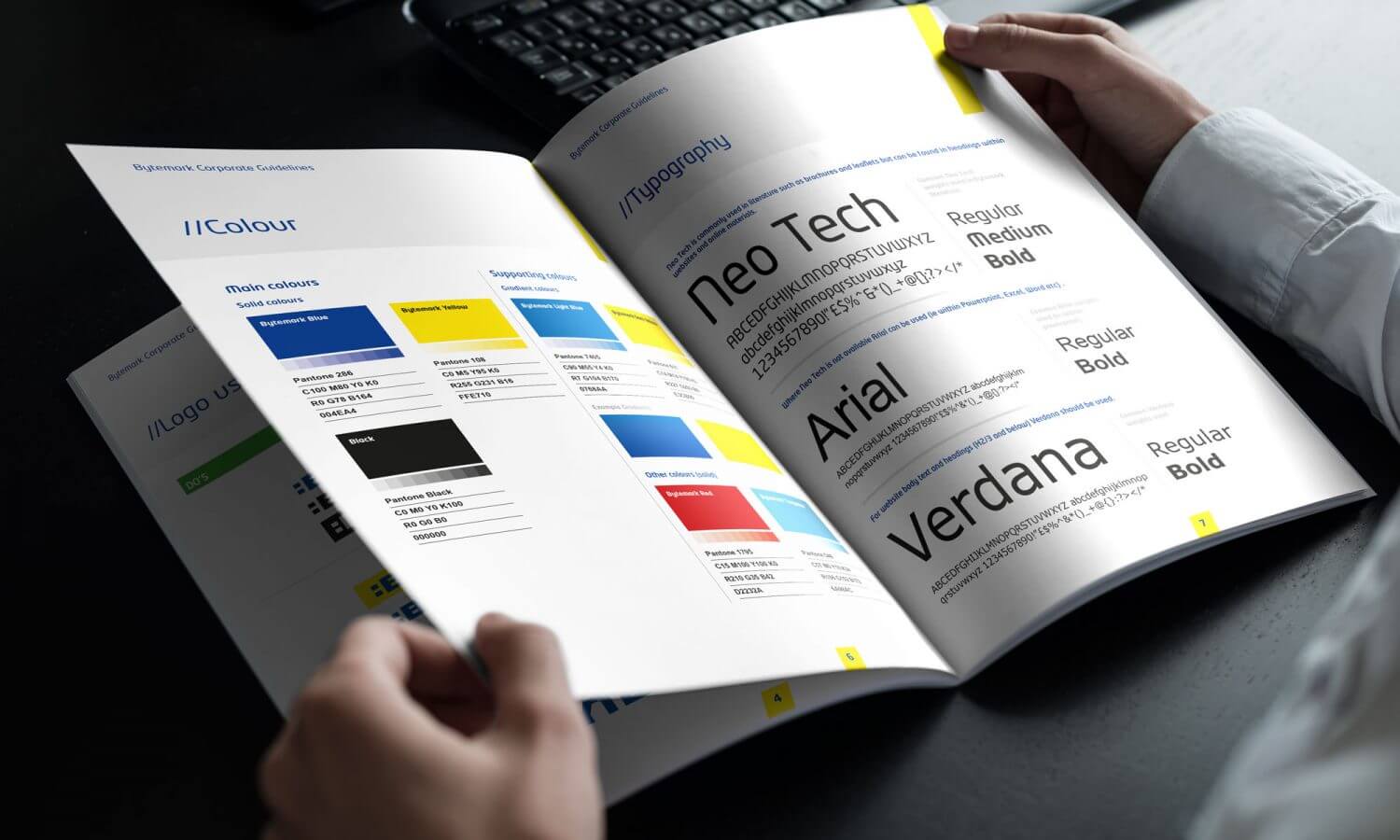
Importantly their existing yellow and blue colour scheme was retained but with differing emphasis (more blue, less yellow) for a more corporate feel.
A distinctive yellow band was introduced as a defining graphic device easily recognised across all media. Additionally a new corporate typeface, Neo Tech, was introduced in order to emphasise the technological nature of the company as well as give it a more distinct style (where previously helvetica was used).
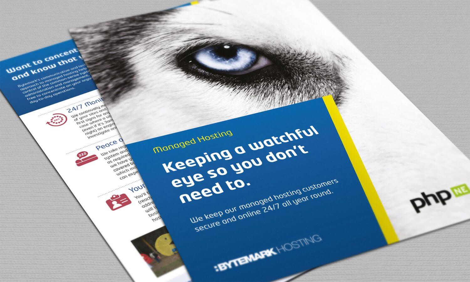
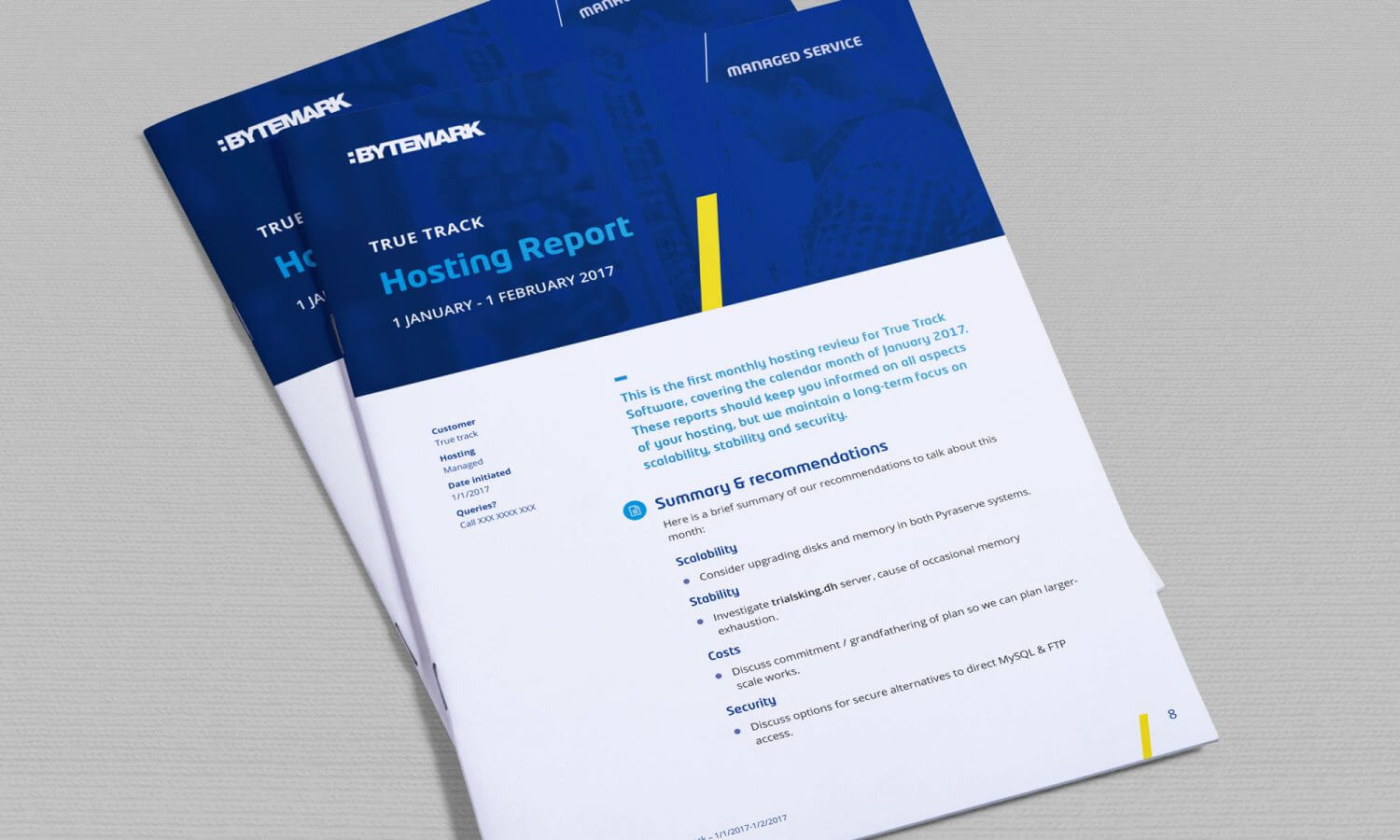
Over the years the identity has grown and encompassed a range of media including websites, leaflets, reports, presentations and stationery,
ClientBytemarkServicesDesign, Art Direction, Document Strategy
