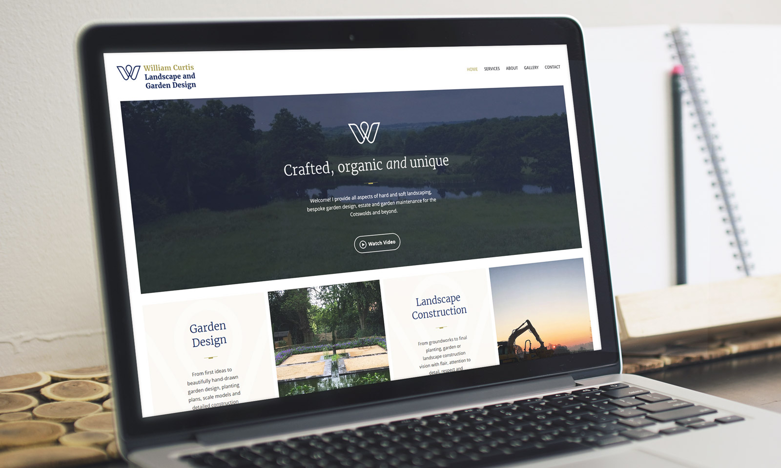
Crafted, organic and unique
Giving this Cotswold landscape and garden designer a visual overhaul to rival their bigger competitors.
Landscape design corporate identity
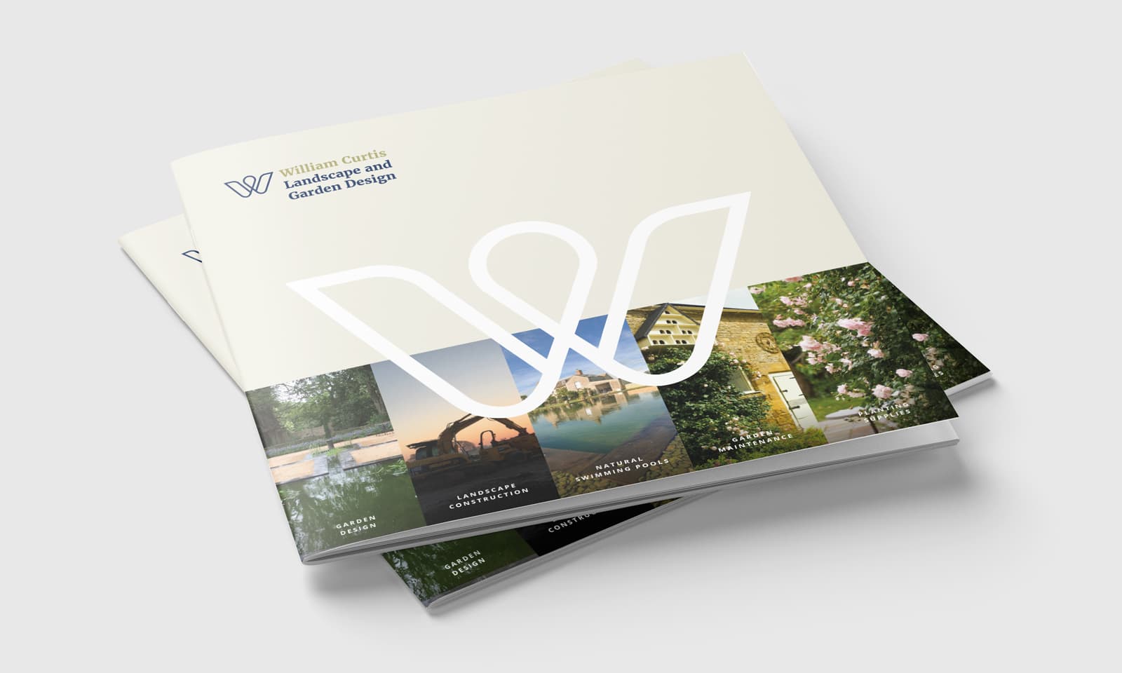
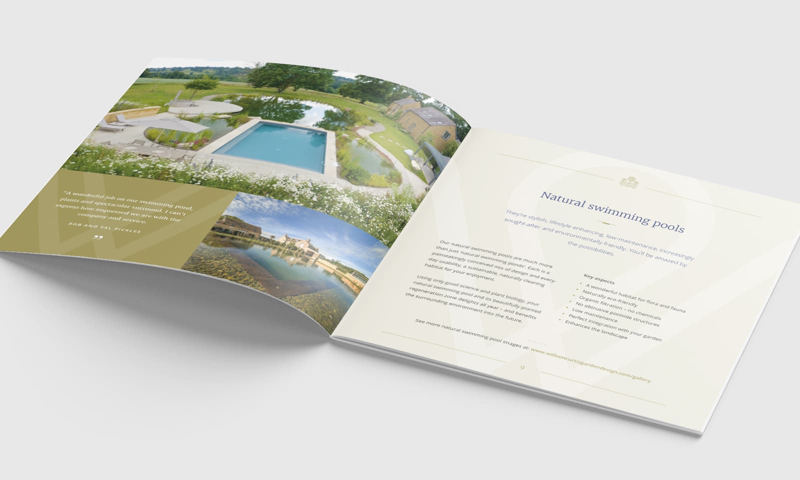
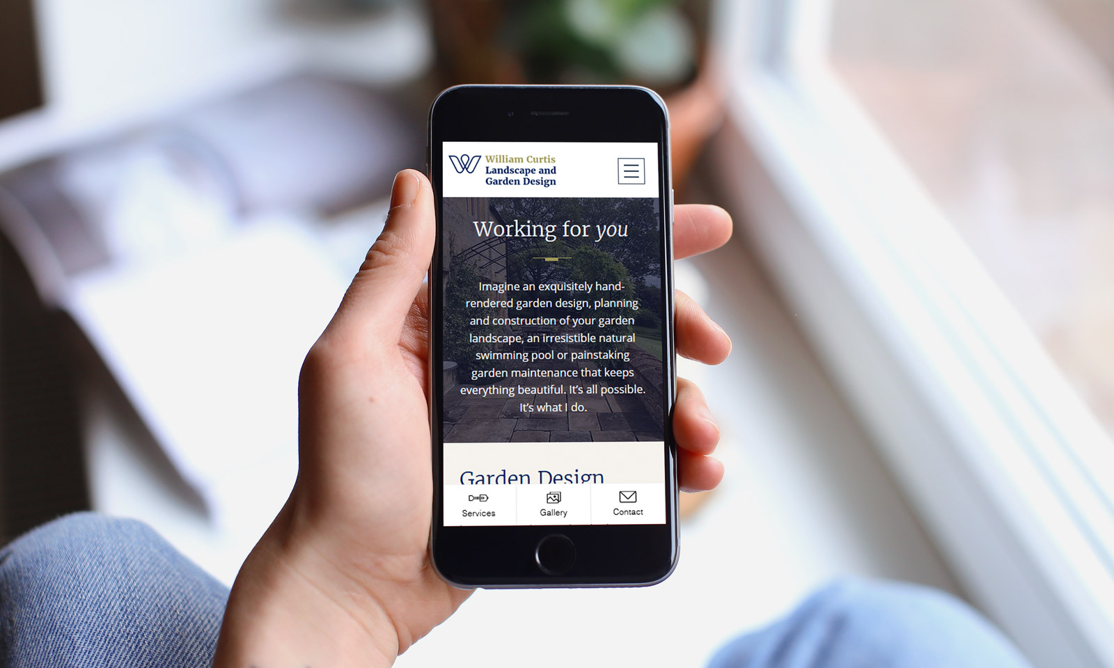
William Curtis, an established Cotswolds garden designer, aimed to revamp his brand to compete with larger firms and attract high-end clients. He specializes in natural swimming pools—organic, lake-like environments promoting environmental sustainability alongside landscape design, planting, and maintenance.
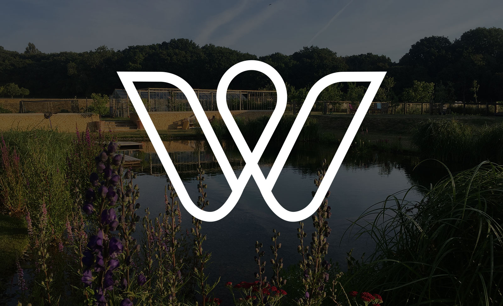
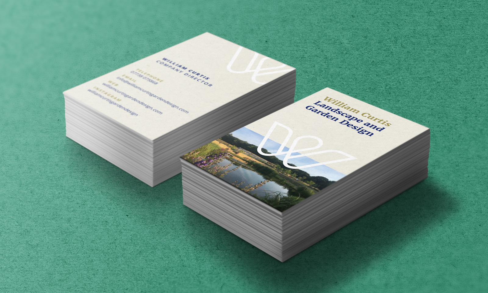
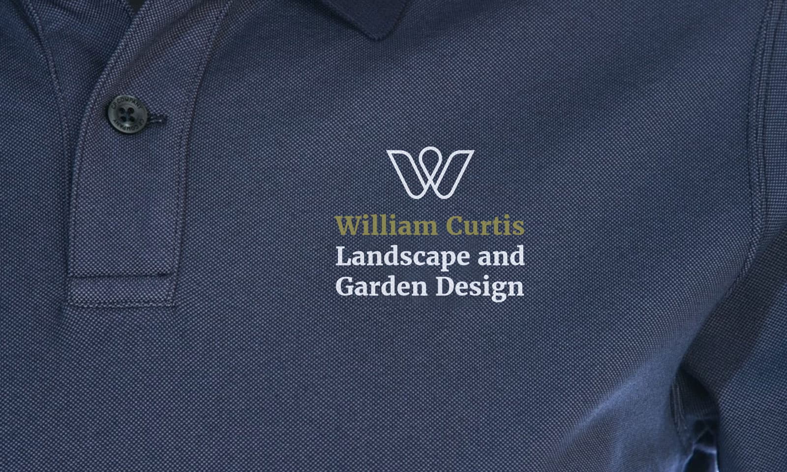
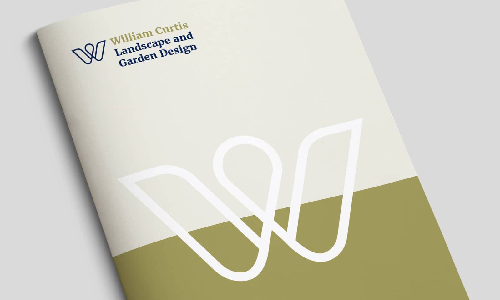
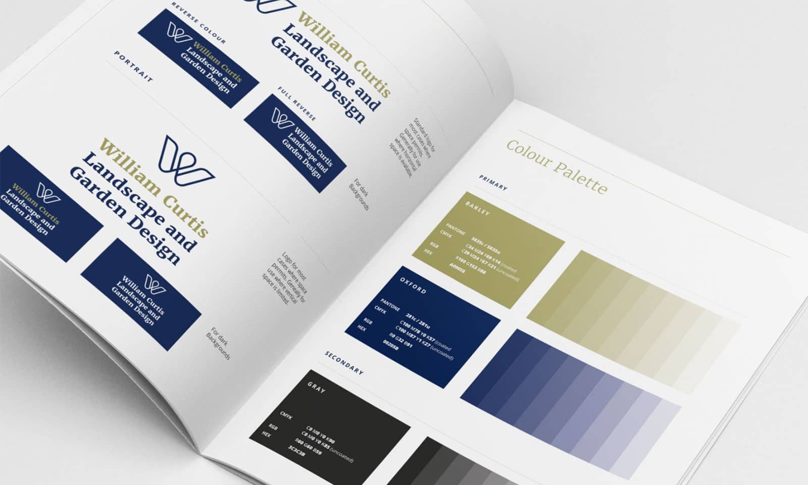
A stylized ‘W’ shaped like a flower became the centerpiece of the brand identity, echoing classic garden designs. Merriweather, a serif typeface, added a classic touch to the modern motif. The color palette featured dark blue for sophistication and barley for warmth.
ClientWilliam Curtis Landscape and Garden DesignServicesConcept and artworkWebsitewilliamcurtisgardendesign.comStyleguideLogo Guidelines