“We’ll be sending it as a PDF only.” is something I often hear. That neon blue you use to support your corporate blue looks great on screen. But once that flyer hits the office printer, the glow’s gone. Your bright accent becomes the brand colour, and the careful hierarchy you built between them disappears. That’s what I call the Screenification of Branding.
Most brands today are born on screen. They’re created in RGB, tuned to glow beautifully on a laptop, a PowerPoint slide, or a Figma mock-up. It’s a world of light: backlit, vibrant, and perfectly designed to look sharp in pixels.
The problems start when these worlds of ink and screen collide. Colour lives in light, not ink, and the moment it crosses over, everything changes.
Take those neon blues that are everywhere right now (just type ‘modern technology blue’ in Pinterest). They look electric on screen; punchy and confident. But print them, and the life drains out (even more so if the paper is uncoated). They sit outside what conventional print presses can produce with their limited CMYK range of colours (four ‘process’ inks mixed together). So, when those neon-like colours hit paper, they collapse into something muted and flat, like a tired version of themselves. What felt bold and modern on screen suddenly looks like every other corporate blue in the pile.
That’s the quiet problem behind so many modern identities. It’s the moment when a digital-first palette meets the limitations of print.
Spot the difference
Imagine a company whose colours were born on screen (their primary brand blue and a supporting sector neon/electric blue).
Now, print them.
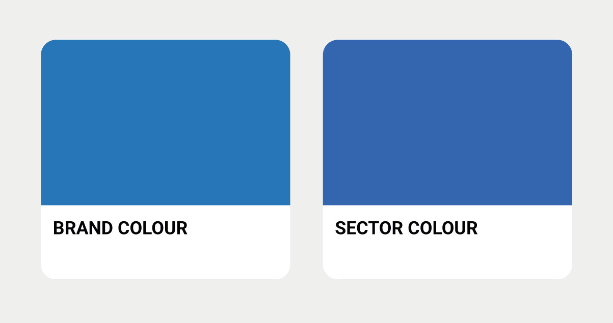
What you’re seeing here are the CMYK versions — one meant to be the hero colour, the other meant to be a category differentiator. That differentiator isn’t really doing its job is it? In fact, you could argue, they are pretty much too similar to be of much use.
But that’s not how that colour was born or intended to be seen.
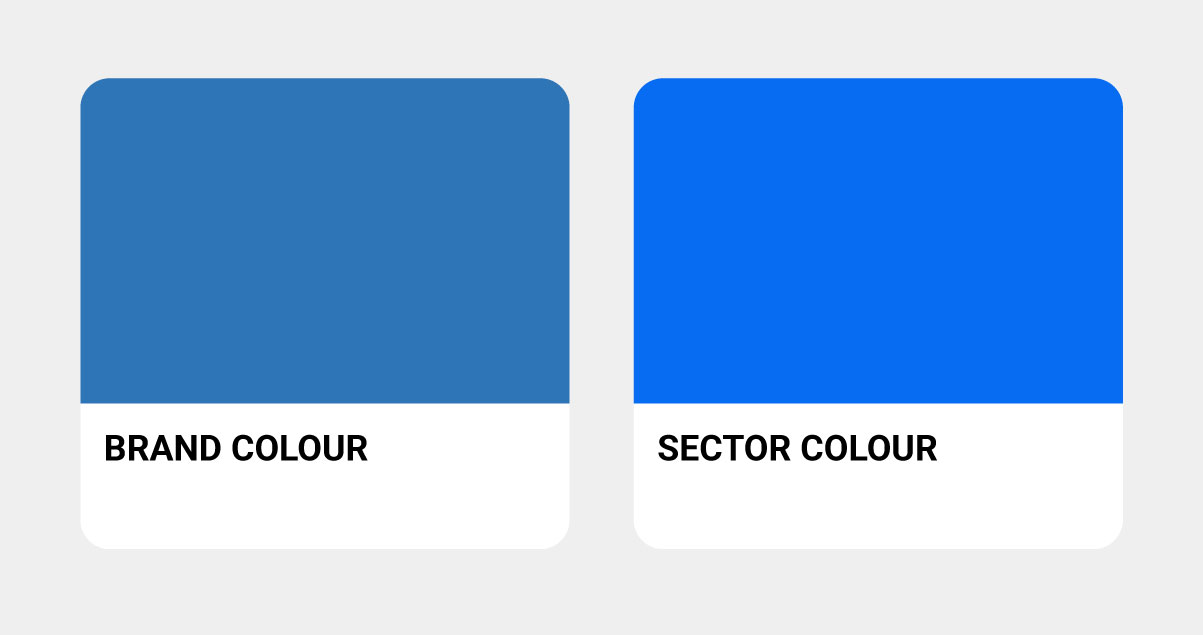
Now you see what was intended — one vibrant, one calmer, perfectly balanced on screen.
See the problem?
That’s the moment when design conceived in light meets the limits of ink.
And that, in a nutshell, is the screenification of branding.
A real-world dilemma
The above example, is real. I’m currently managing a brand whose colours were built with an electric blue as a sector differentiator alongside their main corporate blue. On screen, they’re perfectly distinct wheres one is vibrant and energetic and the other calm and professional.
But in CMYK when printed out? They’re nearly identical.
I’ve raised this multiple times, explained the gamut* limitations, recommended alternatives. But until they see a printed leaflet where their “differentiator” has collapsed into their main brand color, it remains an abstract concern.
So I wait. And I render their style guide deliberately in RGB, because that’s the only way to show them the difference they intended (even though it’s not the difference that will exist in the real world).
It’s a perfect example of screenification in action: a brand system that works beautifully in theory, but fails the moment it meets ink and paper.
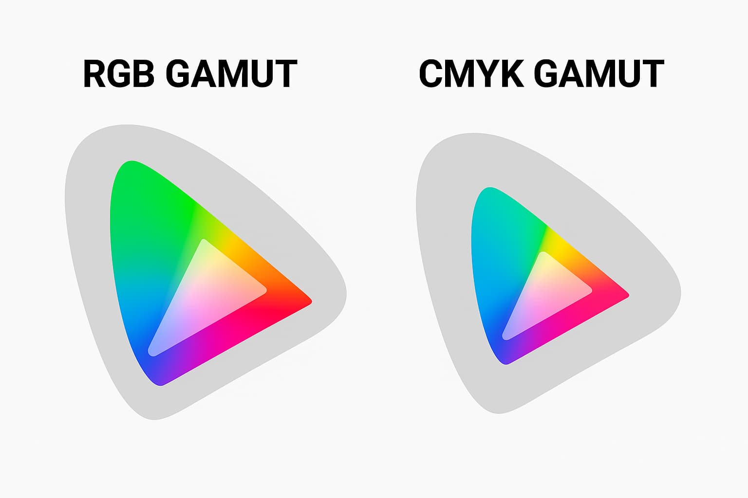
*Gamut is the range of colours a system can reproduce — and CMYK’s range is much smaller than the vivid spectrum a screen can show.
When brands are made of light
For years, we’ve been designing for a glowing medium where Retina screens reward vibrancy, and algorithms reward what “pops”. The brighter the brand, the more visible it feels.
Digital-first palettes became a kind of shorthand: Neon teal meant innovative. Hot magenta meant energetic. Electric blue meant “modern.”
But that intensity only lives within the screen. When brands built in light try to live in the outside world of ink and paper, they fade. Literally.
It’s not just a production issue; it’s cultural. Design decisions are increasingly made in slide decks, not studios. Colour approval happens via screenshots or viewing on screen, not print tests.
And once your brand exists primarily through screens, physical consistency becomes an afterthought.
“Design decisions are increasingly made in slide decks, not studios and colour approval happens via the screen, not print tests.”
The consequence
When colours shift, trust shifts with them. You might not think a small difference between screen and print matters, but audiences do notice — even if they can’t explain why. The blue on your website doesn’t match the brochure. Your signage looks washed out next to the slides. And that printed PDF? Something just feels… off.
None of it seems catastrophic in isolation, yet together it erodes confidence. Inconsistency feels careless, and careless brands don’t feel credible. Reliability of colour builds and maintains trust. And brightness? That just catches the eye.
“Reliability builds trust, brightness just catches the eye.”
The fix: Going ink-first
The simplest way to prevent this is to flip your process. Start with ink, then move to light. Build your palette from CMYK first (or begin with a Pantone spot, then adapt to CMYK) using colours that will survive in the real world before translating them into RGB for screen use. Capture the essence of your colours, not the artificial intensity.
It takes more effort, and yes, it means compromise. Capturing the same vibrancy in CMYK is a fool’s errand – trust me, I’ve tried. I’ve waded through Pantone books, spoken to printers, and posted on forums. No luck, well unless you want to sell a kidney for that A5 leaflet.
Pantone is one answer, but even that has limits. Their neon colours don’t have the range to match what you see on screen. They’re expensive, since that extra bucket of ink adds cost, especially for short-run jobs. And they only achieve that glow when commercially printed, not on your customer’s office printer.
The answer is to begin in pigment, adapt for pixels, and then you’ll end up with colours that stay recognisable wherever they appear.
If you chosen colour only works its magic on screen then you are only conveying your message in one medium, not all.
A tactile workaround
A colleague once found a clever way around the neon-blue problem. Their logo relied on a shade that screens handled beautifully but CMYK could not. Instead of forcing ink to match the colour, they changed the material.
They sourced a paper stock already dyed in that vivid blue. The business card was printed with white ink, leaving the logo as a cut-out in the paper. The details were then printed in black on top.
It was a simple, physical solution. The paper carried the colour. The ink did the minimum. Sometimes the craft is not in trying to force print to behave like a screen. It is in letting the material do the work.
“Build your palette ink-first, colours that will survive the real world, then translate them into RGB for screen use.”
Sharing swatches
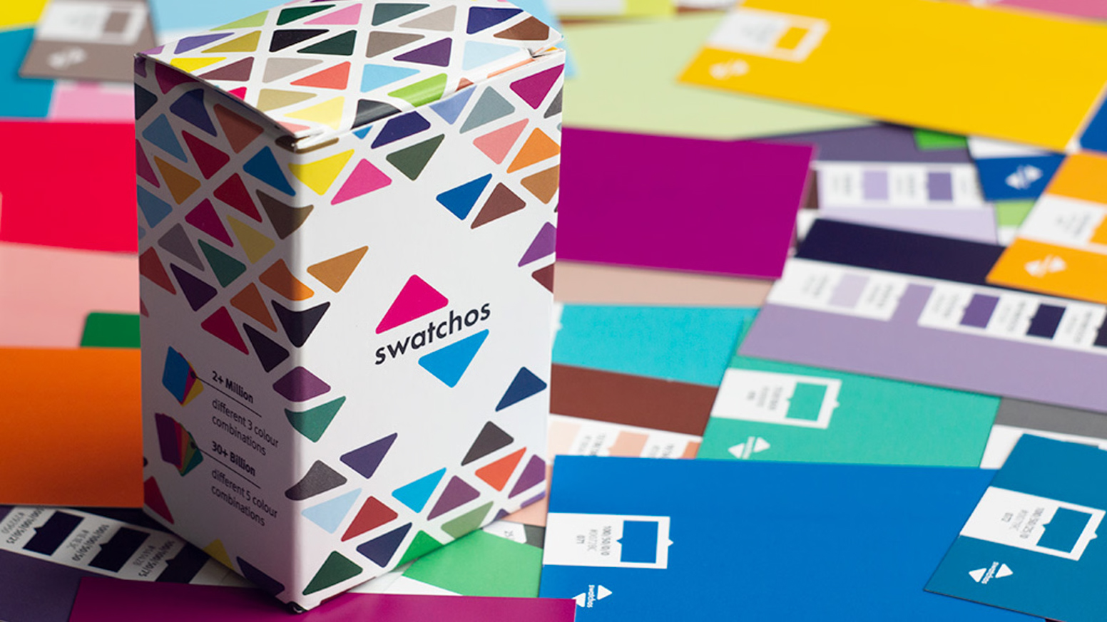
Traditionally, the ideal scenario was for both designer and client to work from the same reference colours. Pantone made this possible with swatchbooks containing removable chips, but they were small, expensive, and only covered pure Pantone inks — not the CMYK process colours most of us actually print with. Still, they served a purpose: everyone could see the same colour in the same light.
A newer and more accessible option is Swatchos, a CMYK-based alternative to Pantone. They don’t have the same range, but they’re affordable (around £38 a pack), portable, designed like a deck of cards and like Pantone, provide colour codes for the equivalent screen-based representation . You can buy a set for yourself and another for your client without breaking the bank (I’ve got a pack sitting on my desk). I’m not being paid for promoting Swatchos, they don’t know I’m even mentioning them. They are just one of a range of swatch books I have.
The real benefit is shared perception. You’re both looking at the same physical reference, not playing the screen-based colour interpretation game. In a world where “we’ll be sending it as a PDF only” has become the norm, that’s a small but powerful act of alignment.