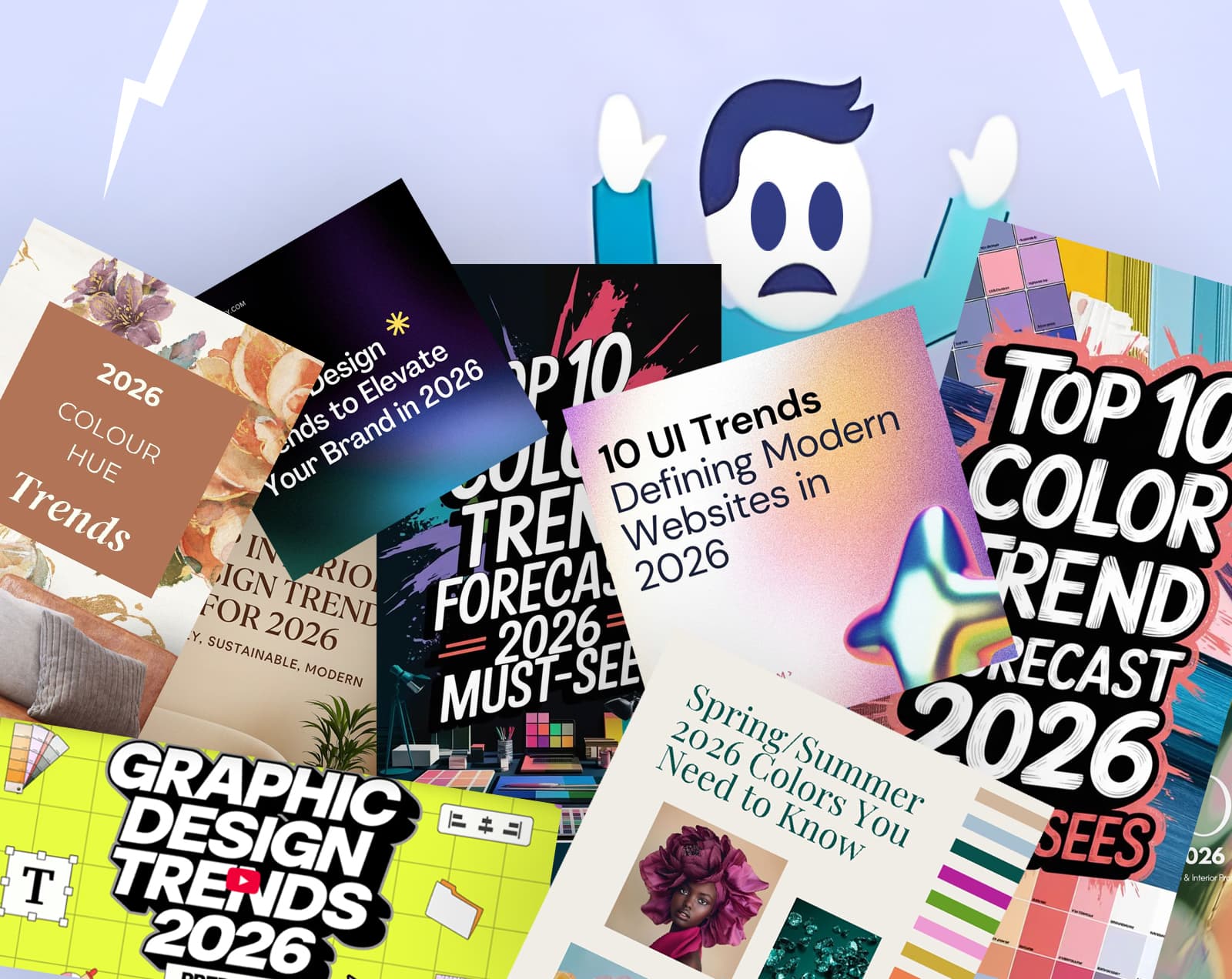
At the end of every year, the design world gets (storm) flooded with lists of whatever branding and design trends will be in vogue for the next year. They’re polished, click-friendly, and easy to scroll/flick through (from Pinterest to It’s Nice That).
But for anyone who creates for a living, the question is: how useful are these annual lists, what are the benefits and the potential pitfalls of following someone elses ‘predictions’.
As 2025 winds down, social media is becoming the equivalent of Christmas advertising. The inevitable deluge of predictions: what’s hot, what’s not, what you need to care about next year.
As a designer, I’m keenly aware of graphic styles that have been popular. Stretchy typography last year. Certain colour palettes the year before. But here’s the thing: I noticed these during the year, as they happened and not because some predictions list told me they were coming. Importantly, I saw them as evidence of what happened that year, not as a roadmap for what’s next.
Which makes me wonder: are these trend forecasters weathervanes, soothsayers or design astrologists, party to some arcane and dark ability the rest of us lack? Or, as I feel, are they just in it for the ego, the validation, and the clicks?
Where annual trends help
Let’s give them their due, an annual trend list can help in some ways:
- Spark ideas. A strange colour combination or unexpected font pairing can pull you out of a rut when you’re stuck.
- Provide a vocabulary. If a client asks about “that new brutalist look,” at least you know what they’re on about.
- Add freshness to short-term work. Campaigns, seasonal graphics, event materials. If something only needs to live for three months, a current aesthetic can work in your favour.
In moderation, trend lists are tools. A moodboard shortcut and there is nothing generally wrong with that.
The pitfalls
However, the problems start when trends become a guiding principal instead of inspiration.
- Homogenisation. If everyone follows the same lists, everyone’s work starts to look the same. Your identity gets buried in a pile of lookalikes (another company using the squishy/elasticated typography style—no thanks).
- Short shelf life. Designs tied to a yearly aesthetic can look tired within months. What felt fresh in January looks stale by June, and positively historic by December.
- Surface over substance. Chasing a look distracts from deeper brand strategy. You’re designing for other designers, not for the people who need to use what you’ve made.
- Client disappointment. What felt current at launch can feel dated by the next quarterly review. Then you’re back at square one, explaining why a refresh is already necessary.
The annualisation of design treats trends like fashion seasons. It creates pressure to refresh for the sake of it. And that cycle is exhausting.
Storm chasing
Chasing trends is a bit like storm chasing. The thrill is real, you catch flashes of lightning and feel close to the action (and you can say you were there when it happened). Storms don’t last, they pass, leaving you with nothing to build on.
Strong brands can chase and survive storms. They’re built for the climate as conditions that last. A trend might pass like a summer storm, but a rooted brand weathers it and can still embrace it.
Trends aren’t evil. They’re weather: fun to notice, occasionally dramatic, but always passing. Watch from the safety of your own brand — just don’t rush out in a copper hat to find the highest point when the lightning starts.
Case study: Brat Summer
In 2024, Charli XCX’s album Brat didn’t just release music. It launched a whole aesthetic and attitude. Neon acid green, rough-cut typography, an ugly-beautiful tension borrowed from Y2K rave flyers, indie sleaze and, importantly, punk. Brat wasn’t just an album cover. It was a cultural moodboard. Fans painted walls, used Brat text generators, declared a whole “Brat Summer.” I’d argue it wasn’t as cutting-edge as it thought it was, but then the target audience probably don’t remember the late 90s, let alone the 70s.
For a moment, it worked perfectly. Bold, disruptive, impossible to ignore. Engineered for virality, designed to stick in the cultural feed. A brief storm in a bottle if you will. I bet that wasn’t on anyone’s “2024 design trends to watch” list.
For designers, it’s a reminder of how short the half-life of trends can be.
But here’s the catch: Charli herself declared Brat Summer over before the year was out. By September, she said “Goodbye forever Brat Summer.” And just like that, what felt everywhere became a closed chapter leaving those who latched onto it adrift with an outdated style.
For designers, it’s a reminder of how short the half-life of trends can be. Brat is already being historicised. Articles frame it alongside postmodern graphic design and early-2000s nostalgia. It’s still referenced, still influential, but not new.
The difference is that for Charli, the aesthetic was part of a bigger story: her music, persona, message. The design amplified that. For most brands, chasing something like Brat would risk looking derivative or dated before the ink dried.
In the US, the Harris 2024 presidential campaign latched onto the Brat aesthetic to reach the same audience as Charli. It was polarising and, to some, felt forced — trend-chasing without substance. It got the press, but did it get the votes? Or even turn people off, like dad dancing? It’s a double-edged sword.
Pictured: The key ingredients of the Brat look and style.
Who can afford to chase and 'weather' these storms?
Not every brand feels the weight of a short-lived trend in the same way.
Indeed, strong brands can dip into a trend without losing themselves such as Apple, Spotify or Nike. Their core identities are resilient enough to carry it. It’s an accent, not a makeover.
Weaker or emerging brands don’t have that buffer. If your brand story is still fragile, chasing a short-term look can erase the little coherence you’ve built. You risk being remembered for the trend, not for yourself (at the very least). And when the hype fades, there’s nothing left to anchor the identity.
Think of it like building materials. Concrete foundations can handle a storm. Wooden frames get knocked around. Strong brands are concrete. They can play with seasonal aesthetics and still be recognised. Weak brands are wood. They get bent out of shape or distintegrate.
“If your brand story is still fragile, chasing a short-term look can erase the little coherence you’ve built.”
The alternative
Instead of chasing lists and trends, start from first principles.
- Build for your brand, not for the year. What fits your identity and audience? What do you actually need to communicate? The answers to those questions matter more than what’s “in.” – It’s like baking a crumble.
- Borrow selectively. If a trend adds meaning to your work, use it. If it’s just novelty, leave it alone.
- Ask if it will hold up. Will this still work in five years, or will it look like a time capsule? Some dating is fine if the project is short-term. But if you’re building an identity, you need something that lasts.
- Prioritise clarity over cleverness. Timeless design isn’t about being boring. It’s about being legible. Hierarchy, structure, and narrative don’t go out of style because they’re not style in the first place. They’re how communication works.
The fickle nature of branding and design trends — or are they?
Take Airbnb’s move toward more realistic, painterly iconography (what we used to call skeuomorphism) as a reaction to flat design. It’s pure early-2000s nostalgia dressed up as something new. Will it stick, and will others follow? Is it short-term trend-setting, or the start of a broader shift in UI design? Perhaps the ease of generating these once time-consuming icons in the age of AI is part of the reason for their return.
Either way, it raises the real question: are we seeing another passing storm, or the beginning of a new climate? So maybe Airbnb’s painterly icons will stick, or maybe they’ll fade like so many branding and design trends before them like a storm in a big mug.
So, finally, just use annual trends as inspiration, not instruction. Because, in the end, design isn’t about chasing what’s next but making something that will last.
In the meantime, get your brollies out; I sense another storm coming.
“Trends are weather. Just don’t rush out in a copper hat when the lightning starts.”
Questions that often come up
Some, carefully. Trends are the weather. Use them to freshen the day, not to rewrite your climate. There are also longer-term movements, from branding to interface design, that act as a weather vane for more considered direction.
Run them through your filters: audience, purpose, and brand values. If a trend helps people recognise you faster or understand you better, keep it. If it just looks new, skip it.
Short shelf life. Fresh in January, stale by June. Too many swaps and your brand starts to feel unreliable and inconsistent.
Little and often beats big and frantic. Nudge type scales, refine colour ranges, update imagery systems. Keep the core steady. And while you may be used to your own brand style and feel it needs a refresh, don’t change things simply because you’re bored. Make sure there’s a clear reason — define the whys.
It depends on where you are in your lifecycle and how aware your audience is of you. New brands can afford to be a little more experimental and trend-driven while establishing their visual collateral. But if you already have an established audience, adopt trends carefully. You don’t want to shock — or worse, alienate — the customers who already trust you.
It makes your story clearer without needing an explanation. If the work needs a caption to justify the look, it’s probably fashion, not fit. As always, consider your audience.