I have a dream. A dream that one day designers won’t need to hand over six different versions of the same artwork. A day when clients wont send a logo that is a tiny PNG, a fuzzy JPEG or a minuscule GIF. I dream of a smart logo format called SPV or the Screen and Print Vector format.
In summary
Designers still hand over multiple logo files for print, screen, and different color modes. SPV/ESVG introduces a smart logo format that puts every colour mode variant in one clean vector.
As a creative, I find it sad that the idea of a single smart logo format is still more aspiration than reality when the need for it is obvious. Designers and clients keep running into the same problems. It is not about doing anything wrong, it is simply the result of a system that makes everyone juggle too many formats for too many situations. From what I’ve seen, the issues fall into two clear camps:
Problem 1:
Designers supplying a mix of formats and variants
Even when everything is done properly, designers end up delivering a bundle of separate files: EPS for print, SVG for web, PNGs for digital use and social platforms that won’t accept vectors. It’s the same artwork expressed in multiple wrappers, because no single format can carry everything such as geometry, RGB, CMYK, Pantone, mono, reverse, metadata, etc.
Problem 2:
Clients send (and use) whatever format they have at hand
A client proudly sends over their logo. It arrives as a tiny PNG, a fuzzy JPEG or, if the gods are laughing, a GIF dragged off their website. Soft edges. Wrong colour space. No vectors. Nothing scaleable or editable.
And let’s not even get into “can you make the logo bigger?”. Ironically, having a tiny logo is the one time that cliché doesn’t apply as scaling is the real issue. Try using that 200-pixel logo on a banner and you’re left with a retro, pixelled tribute to the brand they used to be.
The end result? Clients end up confused and use the least appropriate format. Designers end up duplicating the same file in many wrappers taking time both in exporting them and explaining to customers the reasons for so many formats and their use. There are ways to mitigate some of these production issues, such as automatically exporting all file variants and formats. But the key problem remains: many formats, many files and lots of confusion for the uninitiated.
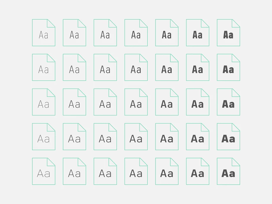
Typical logo export formats and colour variants

The formats/variants we commonly use when exporting logos

Print needs one thing. Screen needs another.
Today the standard practice looks like this:
- EPS or PDF for print
- SVG for screen
- PNGs for platforms that do not accept vector uploads
It works, but it is clumsy. The artwork is identical, yet the formats are split because the colour systems are split.
- Print needs CMYK
- Screen needs RGB
Let’s also not forget variants for print whether they are for coated and/or uncoated paper or reverse (white) and mono (black).
All this duplication makes perfect sense for production, but it makes little sense for handover and long-term brand governance. Clients end up with several versions of the same file and no idea which one to use.
We’ve seen this before with fonts
Fonts are still commonly supplied as separate files for each weight and style. Variable fonts, however, developed jointly by Adobe, Apple, Google and Microsoft, introduced a smarter alternative: one file that holds all the masters, letting the environment choose or interpolate the exact style it needs.
Could logos work the same way? One format which contains the variants of a single logo?
Variable fonts enable many different variations of a typeface to be incorporated into a single file
Why has no one solved this already?
It feels like an obvious problem in need of a solution. So why haven’t organisations or standards bodies tackled it?
The pain is not evenly distributed. Designers and brand managers deal with the confusion, but standards bodies and software vendors rarely feel the urgency. And unlike with variable fonts, there has never been a strong will for the major players to club together and fix it.
In fact, workflow complexity even benefits some toolmakers. The current ecosystem, although clunky, works well enough to avoid becoming a priority. There is no major technical barrier preventing a unified format. What’s missing is alignment: between designers, standards bodies and the big players like Adobe, Apple, Google and Microsoft.
And, even if the industry did align, there are still practical limits that need consideration. I cover those further down, but the short version is that SPV would require both technical adjustments and a bit of collective learning.
The solution: SPV — a smart logo format
Imagine a unified vector format for everything. Let’s call it SPV: Screen Print Vector (a bit like SVG but with bells on). It would be one file containing vector geometry, RGB, CMYK (coated and uncoated), Pantone, mono and reverse variants, metadata, ICC profiles and usage intent. One file. Many outputs. No duplication.
To clarify, SPV isn’t about storing every possible version of a logo but only the cases where the artwork stays identical and the colour environment changes.
Inside an SPV file
At its core, an SPV logo contains only three things: geometry, colour definitions and metadata.
Geometry
Geometry appears once as clean vector paths (much like an SVG).
Tokens
Instead of fixed CMYK or RGB values, each path references a colour token. Each token can hold several variants such as RGB, CMYK (coated or uncoated), spot, mono and reverse.
Metadata
Metadata defines how the file should behave: colour intent, ICC profiles, fallback rules and even usage rights. Apps that work in RGB pick the RGB variants only (typically “colour”, “black” or “white”). Print-focused apps prioritise CMYK variants but can still accept RGB if needed.
The basic structure of the Screen Print Format (SPV)

The basic structure of the Screen Print Format (SPV)

One logo, many definitions. SPV keeps them all in one file, not ten.
How this would work?
SPV only makes sense if it behaves naturally inside the software we already use, from Indesign to Word.
Design software
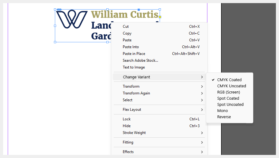
Take InDesign as an example.
- User imports the SPV file like any other.
- On import, they are asked which variant they want to start with.
- Changing variants happens through a right-click menu on the graphic: SPV Variants → choose the one you need.
- If an RGB variant is used, a small warning symbol could flag the mismatch*.
The UI pattern already exists. SPV simply adds an extra option.
*It would not block anything, it would simply mirror InDesign’s current behaviour where RGB images are allowed but highlighted. Modern RIPs convert them automatically at press time, but the resulting CMYK values may not align perfectly with the intended brand colours.
Mock-up of how InDesign could handle SPV files
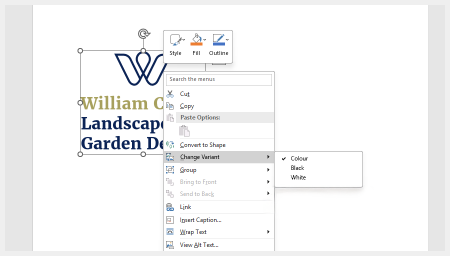
Office software
For Word and PowerPoint, the logic is simpler. These apps only work in RGB. So they read only the RGB tokens. That ensures clean, accurate logos without clients juggling formats. A right-click shows simple, human names: Colour. White. Black. No CMYK. No Pantone. Just the essentials.
Word interface showing the simplified SPV options
Websites and apps
Could SPV be used within a website or mobile app? Yes. As an SPV file is still valid SVG, browsers and app frameworks would display it like any normal vector.
By default, the RGB version would appear automatically and, with a little CSS (or native styling in iOS/Android), the interface could switch variants on the fly.
And finally, the geometry itself would reference neutral tokens such as ‘–primary’, and the styling can remap those tokens to colour, mono or reverse versions depending on context (ie. when the logo is ontop of a dark background or a user’s device switches to dark mode). Instead of loading separate logo files, the website/app simply tells the logo which variant to use.
What would it take to build SPV?
Adobe Illustrator is the natural starting point, because AI files act as the source for almost every export format designers use.
A possible workflow:
- Design the logo
- Create a palette of core colours
- Right-click a swatch and select SPV Options
- Access the variants for each colour mode and apply their respective values
Illustrator SPV panel showing colour modes and their token values
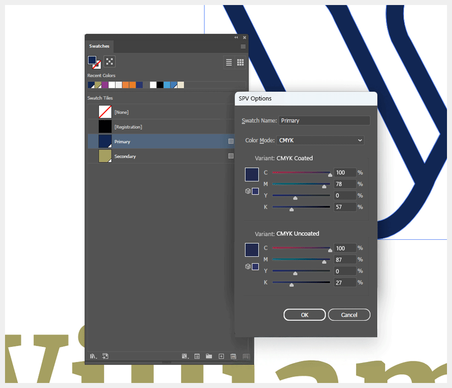
In the SPV panel shown above, CMYK sits under one heading, with Coated and Uncoated as variants you can fill in. One swatch name, many definitions: RGB for screens; CMYK Coated and Uncoated for print; Spot, mono and reverse if needed. No duplicates.
The SPV panel is simply where you store those variants. Which one actually shows on the artboard is a separate choice, either made automatically by the app or switched manually by the designer. That part isn’t the point of this mock-up; I’m just illustrating the idea, not dictating how the UI should look.
Naming colours
SPV does not require colours to be called ‘Primary’ or ‘Secondary’ (even though I have used them within this article). A swatch can be named anything the brand prefers. Corporate Navy, Accent Gold, Neutral 01, Button Highlight. SPV treats them all the same.
The name becomes the label for a set of variants. On export, SPV generates the necessary tokens:
- corporate-navy-rgb
- corporate-navy-cmyk-coated
- corporate-navy-pantone
This gives designers full freedom with names. SPV keeps everything organised behind the scenes.
Can one smart logo format really contain everything?
If we are talking about vectors, yes. SVG is already the standard format for screen-based vector graphics. It is used in browsers, apps and even Word and PowerPoint for one simple reason: it is a clean, scalable vector format. It stays sharp at any size, it is lightweight and it behaves predictably across devices. Most clients still reach for PNGs because that is what they recognise, but SVG is the format that actually preserves quality.
From SVG to ESVG
SPV builds on the SVG foundation. In practice, it makes more sense to think of it as ESVG (Enhanced SVG): the same familiar vector format, but with the structure designers always needed. ESVG would formalise multi-mode colour tokens, Pantone definitions, usage intent and predictable behaviour across design and office tools. It is not a new format. It is an evolution of one that already works.
SVG is the right basis for this. It is open, extensible and supported across browsers, design tools and office software. Other formats are either inflexible (PNG, PDF), unsafe (EPS) or locked to a single vendor (Adobe Illustrator’s ‘AI’ format). The path forward is the one we have already seen elsewhere. Just as PDF evolved into PDF/X, OpenType evolved with variable fonts, SVG can evolve into ESVG.
It’s not a new format but an evolution of one that already works (SVG).
Under the hood
Let’s get geeky for a moment and look at what the code might actually look like inside the file.
Scroll
<esvg version="1.0">

<!-- Colour Tokens -->
<style>
:root {

/* Primary colour */
--primary-rgb: #00205b;
--primary-cmyk-coated: c100 m78 y0 k57;
--primary-cmyk-uncoated: c100 m87 y0 k27;
--primary-spot-coated: PMS281;
--primary-spot-uncoated: PMS281;
--primary-mono-rgb: #000000;
--primary-mono-cmyk: c0 m0 y0 k100;
--primary-reverse-rgb: #FFFFFF;
--primary-reverse-cmyk: c0 m0 y0 k0;

/* Neutral token used by geometry */
--primary: var(--primary-rgb);


/* Secondary colour (Pantone 5835) */
--secondary-rgb: #A09958;
--secondary-cmyk-coated: c34 m24 y69 k14;
--secondary-cmyk-uncoated: c29 m24 y67 k21;
--secondary-spot-coated: PMS5835;
--secondary-spot-uncoated: PMS5835;
--secondary-mono-rgb: #000000; /* optional custom behaviour */
--secondary-mono-cmyk: c0 m0 y0 k100;
--secondary-reverse-rgb: #FFFFFF;
--secondary-reverse-cmyk: c0 m0 y0 k0;

/* Neutral token used by geometry */
--secondary: var(--secondary-rgb);
}
</style>

<!-- Metadata -->
<metadata>
<intent default="print" fallback="rgb" />
<icc-profile src="ISOcoated_v2.icc" />
<version>1.0</version>
</metadata>

<!-- Geometry -->
<g id="logo">
<path id="mark" d="M10 40L190 40L100 160Z" fill="var(--primary)" />
<path id="type" d="M220 80 L330 80 ..." fill="var(--secondary)" />
</g>
</esvg>
What this code is actually doing
This example shows how a smart logo file could work inside an ESVG (Enhanced SVG) document. There are three main parts:
- Colour tokens – the brand colours in all their variants, such as RGB, CMYK, spot, mono and reverse
- Metadata – information about colour intent, ICC profiles and versioning
- Geometry – the actual logo shapes, which stay colour-agnostic and reference neutral tokens such as ‘–primary’ or ‘–secondary’
It’s not entirely plain sailing
Whilst all this sounds promising, there are practical reasons why a unified format hasn’t emerged yet. None of these are insurmountable, but they’re worth acknowledging:
Security says ‘no’
Social platforms currently don’t allow SVG uploads because the format can contain scripts, external links and other dynamic behaviour that needs heavy ‘sanitisation’ (removing scripts and external references).
But SPV/ESVG could change that. If designed as a strict, safe subset of SVG with no active content (just geometry, color tokens, and metadata) it would avoid the security concerns that keep platforms locked to bitmaps. A properly specified SPV format could be inherently safe, giving social platforms no reason to block it.
If adopted, social platforms could accept both formats and provide users with a choice between a clean vector or a traditional bitmap. No more mandatory PNG exports and resulting quality loss when vectors would work better — just the optimum format for the job.
The new learning
Any new technological shift needs time to settle. Designers have to understand it, trust it and see it behave predictably in real projects. That takes a while to filter into the collective understanding of the design community. Yet once the benefits become obvious, people tend to ask the same question: “Why didn’t we do this sooner?”
Additional UI
From creating the format to importing it, software developers such as Adobe and Microsoft would need to adapt their tools to support a multi-token logo file. That means new panels, new options and a slight rethinking of how colour variants are handled.
Where SPV stops: when the shapes change
SPV is built around a simple idea: one set of vector paths can reference multiple colour modes. It doesn’t try to replace situations where the shapes themselves change, like optically adjusted reverse versions, simplified favicon cuts, or heavier outlines for embroidery. Those remain separate assets. What SPV removes is the multiplier. If you need three different shapes (full logo, simplified icon, embroidered version), you’d maintain three SPV files instead of 36 separate exports.
Multiple geometry blocks sound elegant, but in practice they create a heavy, ambiguous file. Most software wouldn’t know which shape to display, and the user wouldn’t know which one they’re editing.
That said, multiple geometry iterations inside one container isn’t impossible. A future ESVG 2.0 could hold optional geometry blocks, much like a PDF holds multiple pages. But that’s beyond the scope of what this version is trying to fix and comes with its own challenges.
Why this is fine
None of this undermines SPV. It simply marks the point where the intelligence stops. SPV still gives you one canonical master containing consistent RGB variants for social exports. The workflow is simpler and more reliable even if the final step remains a bitmap.
These limits will not last forever. Browsers support colour fonts. Figma has variable modes. Adobe is gradually shifting toward a more unified colour system across apps, which is essentially token-based. SVG sanitisation is improving and AI design tools already read colour variables. The direction of travel is clear.
Beyond logos?
This article focuses on logos because they highlight the problem most clearly. But the same principles could apply to other vector assets that need multiple colour modes, such as icons, UI elements, illustrations or branding marks. Logos are simply the first place where the benefits are obvious.
The technology exists. The logic is sound to me. All that’s missing is alignment.
One file to end the chaos?
So after all that, could SPV, or a future ESVG standard, finally put an end to the eternal multi-file export circus?
Well, having one file would certainly end the guesswork for clients, keep colours looking consistent, cut the duplication, make handovers easier and give everyone a clear source of truth.
The industry is already close: the tools exist, the logic is sound to me, and the benefits are obvious. All that’s missing is the standard.
Yes, it may be a little pie-in-the-sky, and there are plenty of implementation challenges. But after years in this business, I would love to hand a client one file and simply say:
“Here you go. Select colour, white or black.”
Is that really too much to ask, or are the powers-that-be (or the SVG working group) already on the case?