Crafted, organic and unique
Giving this Cotswold landscape and garden designer a visual overhaul to rival their bigger competitors.
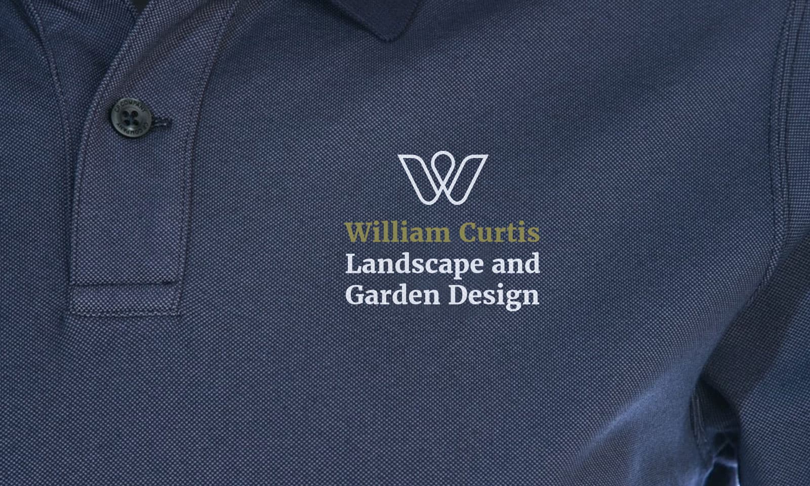
Landscape and Garden logo design
William Curtis is an established garden designer in the Cotswolds who sought to improve their brand to be competitive with larger organisations and attract high-end customers.
His specialisation, above and beyond landscape design, planting and maintenance, are natural swimming pools – organic and lake-like environments which are actually swimming pools which are natural and good for the environment.
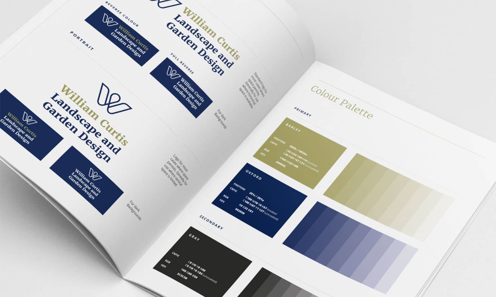
This logo design was designed as a stylised ‘W’ in the shape of a flower was refined and developed. The elegance, symmetry and rhythm, reflected in the motif, was designed as a nod to classic gardens and landscapes.
Typography was courtesy of Merriweather, a characterful serif typeface which provides a counterpoint to the modernist motif – helping establish the brand as a classic and contemporary organisation.
Colour was based on the classic pairing of dark blue (classic and sophisticated) and barley (warm and earthy).
ClientWilliam Curtis Landscape and Garden DesignServicesDesign, Art Direction, ArtworkingWebsitewilliamcurtisgardendesign.comStyleguideLogo GuidelinesRelatedIdentity